Heimkapital – Brand & Website Design in 5 Weeks

The team at Heimkapital reached out to us in early 2020. Their vision was to shake up the German real estate market and they asked us for help in creating their website and shaping their brand.
We traveled to Munich to run a kickoff workshop based on Jake Knapp’s GV Brand Sprint methodology. The outcome was a sharp understanding of the Heimkapital audience, market, and major challenges.
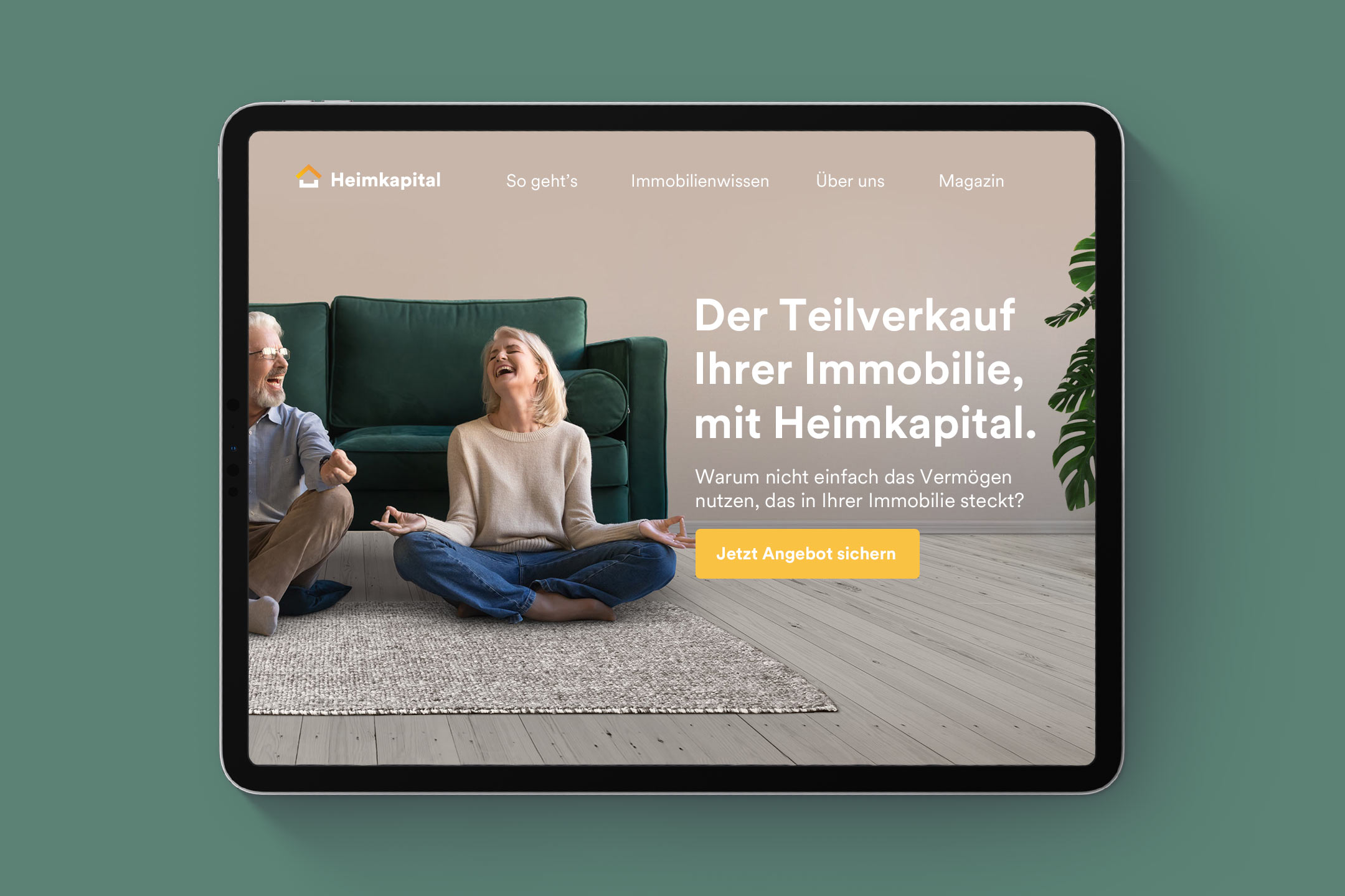
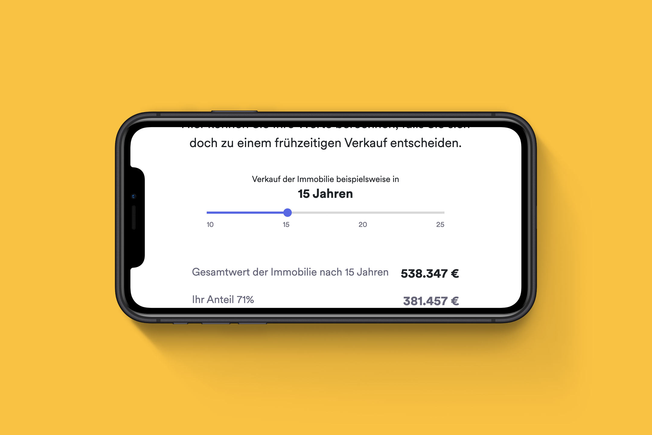
Consequently, we started to manifest the vision by creating wireframes for the Heimkapital website. We collected all relevant content and developed engaging screen designs.
The team at Heimkapital had pre-selected the colors blue and orange to represent trust and prosperity which we evolved with a unique design system. Through a unique interplay of colors, typefaces, photography and UI elements we managed to bring the Heimkapital brand to life.
We also developed a new logo for Heimkapital, consisting of a simple shape symbolizing the „concrete gold” which is locked in their customers’ real estate. We chose a simple, clean approach to build both credibility and potential for identification with the target group.
Thanks to our working model of seamlessly aligning screen design and technical implementation, we managed to complete the entire brand and website design in just five weeks.
- Client: Heimkapital GmbH
- Industry: Finance
- Project Lead: Johannes Ippen
- Published: 2020
- Website: https://heimkapital.de/